Top 10: Worst football kits ever. No 2 has leather accessories, we couldn't believe our eyes

Sierra Leone (2012)
You’ve probably never heard of this team, and you have every reason not to. Unfortunately this is the only thing they’ve gotten recognition for in, as they either don’t qualify for International tournaments or don’t get very far after qualifying. These kits have made quite the statement for the team with a teal to blue fade and what looks to be a wild cat on the front, is a definite conversation starter.
Australia (1990)
Looking like someone just took a paintbrush and a paint pallet of the australian colors, this kit is an absolute work of art in its own special way. With the 90’s taking a turn for the worse with many kits, as you’ll see later this is just one of many “unique” kits to be produced.
Hull City (1992)
Another gem from the 90’s Hull City were trying to show everyone they’re tigers and they’re to be feared. I don’t know many people who can be taken seriously wearing a tiger printed soccer jersey let alone an entire soccer team.
Coventry City (1978)
One of the older kits on this list, Coventry City made a statement by playing the 78/79 season in a brown kit. Not ugly for a design of any sort, it’s actually quite tame as far as design does, they could’ve been better when it comes to color choice, brown doesn’t look good on any team.
HuddersField United (1993)
In the same category as your least favorite Christmas sweater you have hidden away, This beauty is ugly inside and out. There isn’t much to say about it, the jersey speaks for itself. With a weird design and poor color choices, the 90’s have outdone themselves again with another ugly sweater.. i mean jersey.
Liverpool (1995)
Keepers should get a big pay raise every time they had to slip this bad boy on. Liverpool gave that honor to their keeper during the 95/96 season, which in the end he got no pay raise for wearing this monster. Let’s hope adidas doesn’t try to work with this design and keep it in the 90’s with the rest of the ugly kits.
Dundee FC (1953)
The oldest kit on here dating back to the 50’s, where it belongs, is probably one of the worst patterns you could put on a football kit, along with the colors chosen. While looking like they’re wearing a kilt that was converted to a shirt, Dundee FC finished in 7th place, think they would’ve done better if they had better looking kits?
England (1996)
Another international mess, England goalkeepers David Seaman, Tim Flowers and Ian Walker all had the chance to wear this. The jersey speaks for itself, with whole mess of colors and letters and a crest, this jersey is the definition of a “beautiful mess”
Colorado Caribous (1978)
Never i repeat NEVER should a football jersey have leather hide fringe, nothing about this jersey looks comfortable or wearable. This might be the reason the team only lasted one season and in that season went 8-22…
Regina (2012)
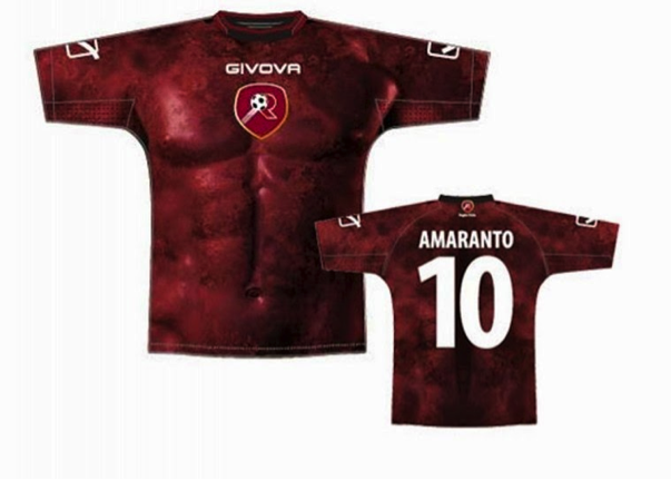
This honestly speaks for itself, i on the other hand am speechless…


No comments:
Post a Comment